Art Museum Template Refresh
After implementing a new email campaign automation tool, I designed a fresh new template for the Art Museum’s quarterly newsletter.
Company
Fairfield University
Year
2021
Category
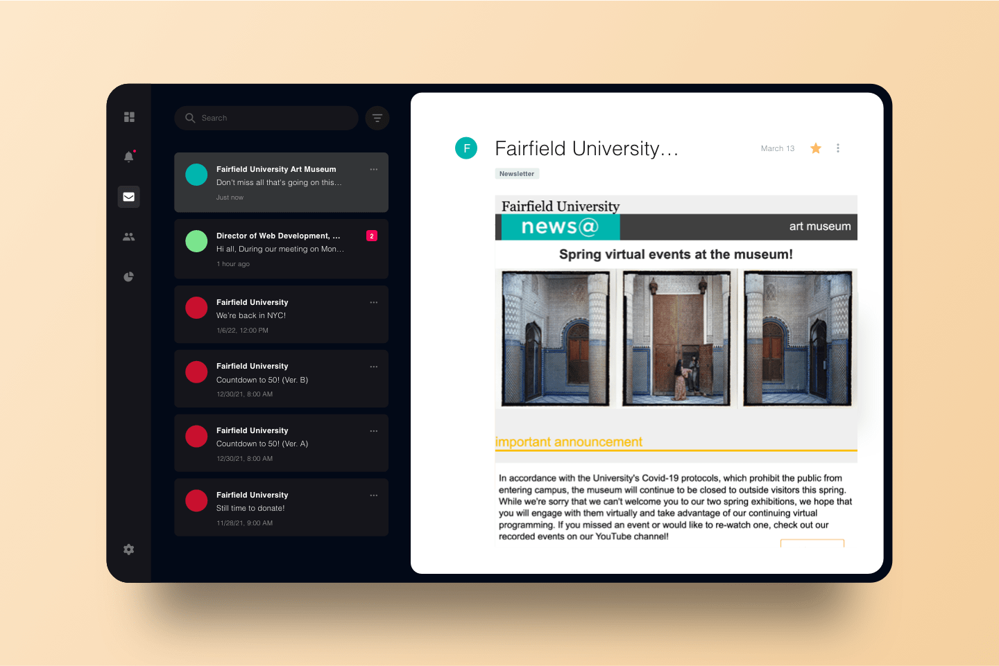
Before.


(Anyway.)
Drama Aside...
Ragged Lines
Off-Brand Colors
Outdated Design
The legacy template for the Museum was designed and implemented before my arrival. The one thing I knew was that, regardless of how or why it was implemented with off-brand colors and styles, it needed to change.
New campaign automation system, new templates, baby.
![“There will never be a better time [to strengthen and unify branding] than now.”](../../images/portfolio/web-design/professional/fairfield-university/fuam-template-refresh/quote-section_vertical.svg)
[ These elements are interactive. Drag & Drop them into each of the sections! ]


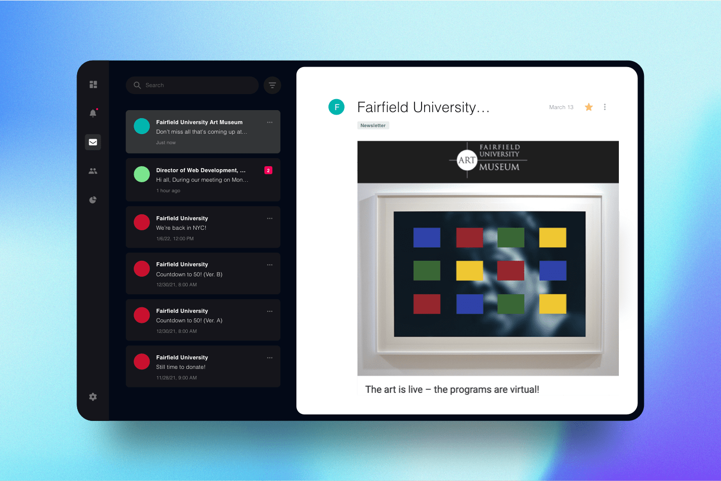
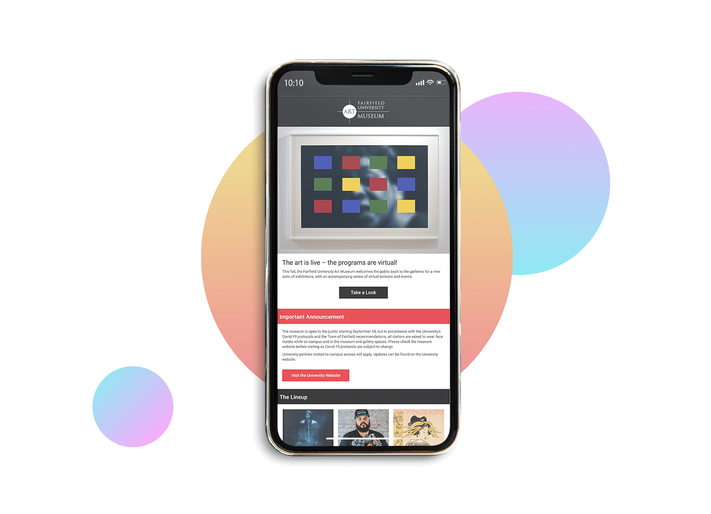
After.
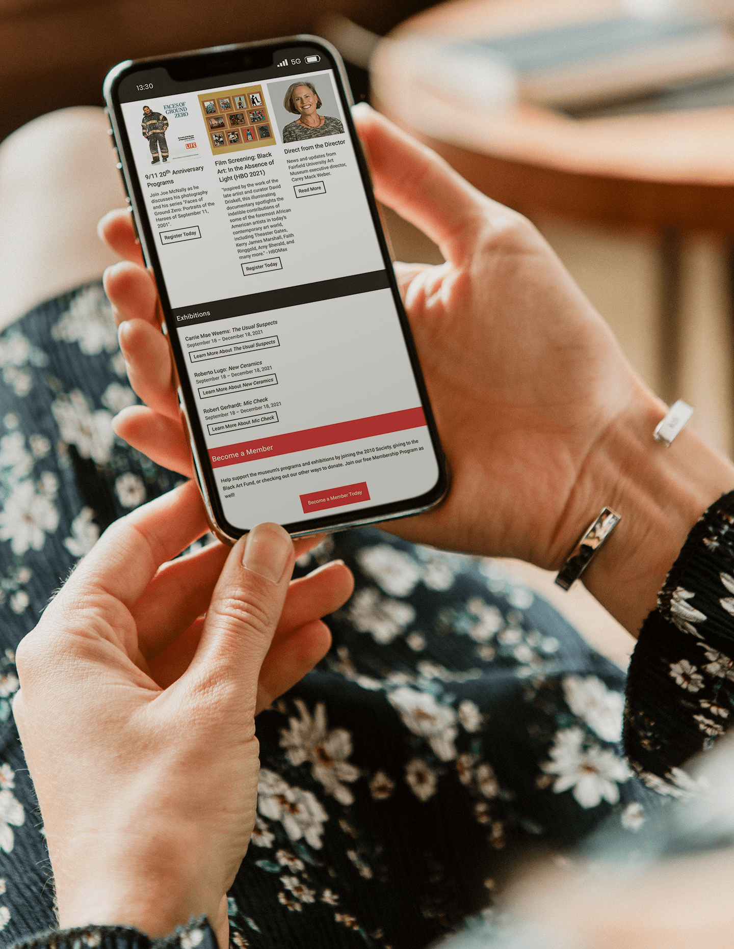
Not only has the new template brought the Museum's newsletter into the modern era, the revised layout and fresh coat of [branded] colors have united it with the rest of Fairfield University's digital marketing package as a whole.
Sleek Components
Branding Approved
Cohesive Design
“About” Page Redesign
Previous Project

Get in touch.
Like what you see? Have a question? Excited to be able to soon peruse projects?
Let’s chat! Send me an email at:
lc.scorcia@gmail.com.
