
C0DEYSSEUS Redesign Case Study
C0DEYSSEUS is my online presence. It's my persona, my art & design presence, my art handle on just about every social media website, and (hopefully, one day) my Twitch channel. For the purposes of this case study, we'll be focusing on c0deysseus.com — my aforementioned art & design portfolio.
C0DEYSSEUS is a lot of things, but at its core... it's me.
Company
C0DEYSSEUS
Year
2023 (Ongoing)
Role
Front-End
Prototyping
Copywriting
(Everything, really)

The Client.
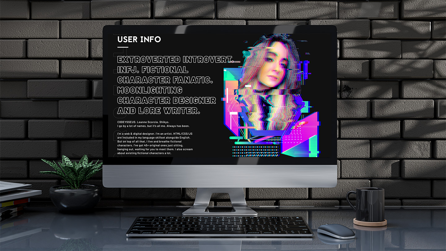
Hi, it's me. 👋 I'm the problem (and the client).
As a designer and a creative, I'm constantly pushing myself to new limits and to develop new ideas. When I'm not working my 9–5, I'm pouring my heart and soul into a video game concept that's been in development for the past 13+ years. Part of that creative journey has included the development (and devotion) to an entire subsection of my art & design, creative portfolio — an online presence I've established as C0DEYSSEUS.
The Challenge.
The last time I updated c0deysseus.com was three years ago (2020). I've grown as a person, an artist, a creative, and a web designer/developer. Basically, I'm not who I used to be. 💁♀️🔪 In an effort to eventually stream on Twitch, I began rebranding my identity as C0DEYSSEUS (complete with an upgrade from all lowercase to all uppercase stylization). What followed is what I'm slowly implementing across the c0deysseus.com website. Look'it you, getting a top-secret, insider look!
Upgrade
&
Rebrand
The Approach.
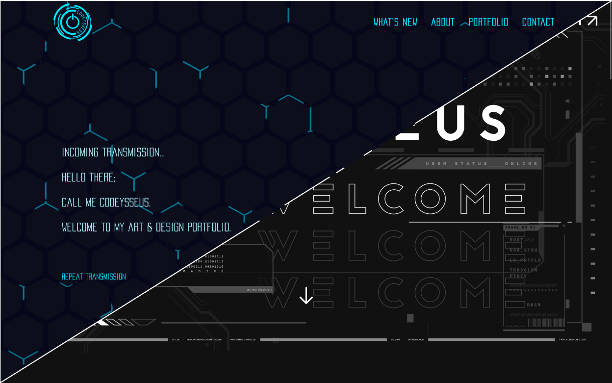
After having designed an "Offline" Twitch banner, I used that graphic screen as a foundation on which to [re]build C0DEYSSEUS as a brand. The main goal of this redesign/rebrand was to make scrolling through the website an experience. In the spirit of video games, I wanted perusing the site to be an engaging visual experience — but one that would truly reward those who took the time to pick through the subtle, nuanced details.
- Iterative
- Meticulous
- Responsive-centric
- Iterative
- Meticulous
- Responsive-centric
Art Direction
Typography
I chose a thick, subtractive font to be used strictly for headers and the new logo. Jaapokki blends futurism with a bold sense of timelessness; it was a no-brainer.
Color Palette
I flattened the main palette to be monochromatic (and reminiscent of a console window) with subtle accents.
Aesthetic
"Mainframe" computer console/terminal. I wanted to stick with the original concept—and push it even further.
Total. Overhaul.
"From the ashes," as they say...
The Process.
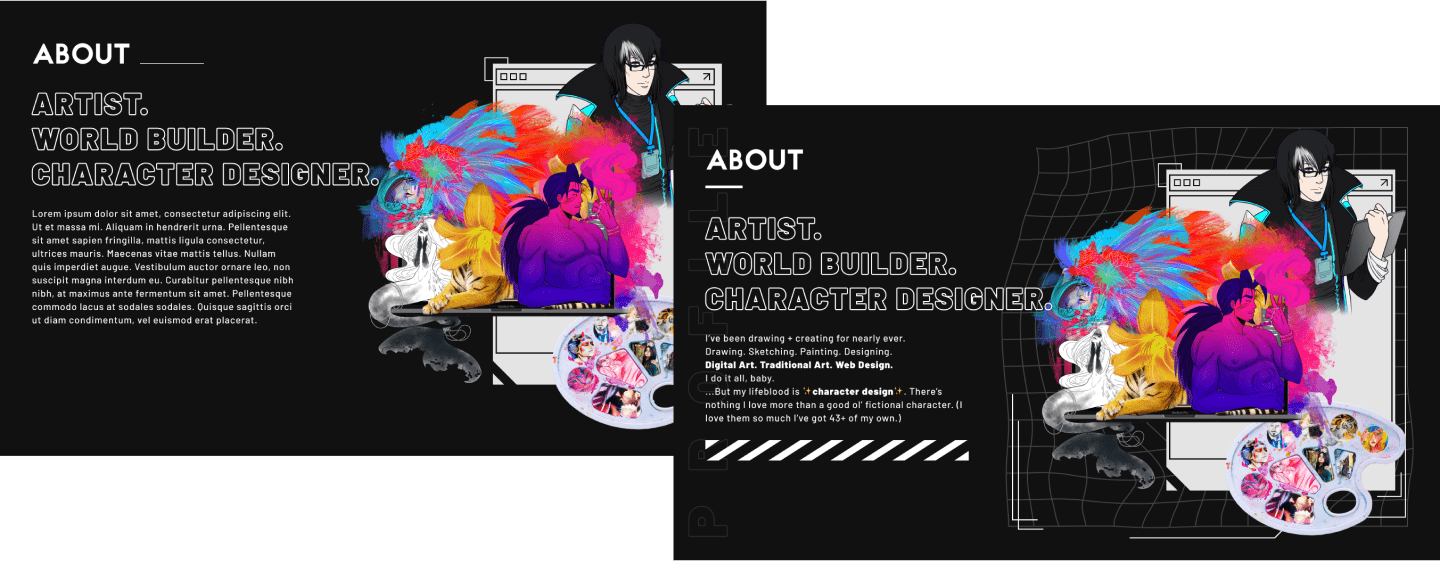
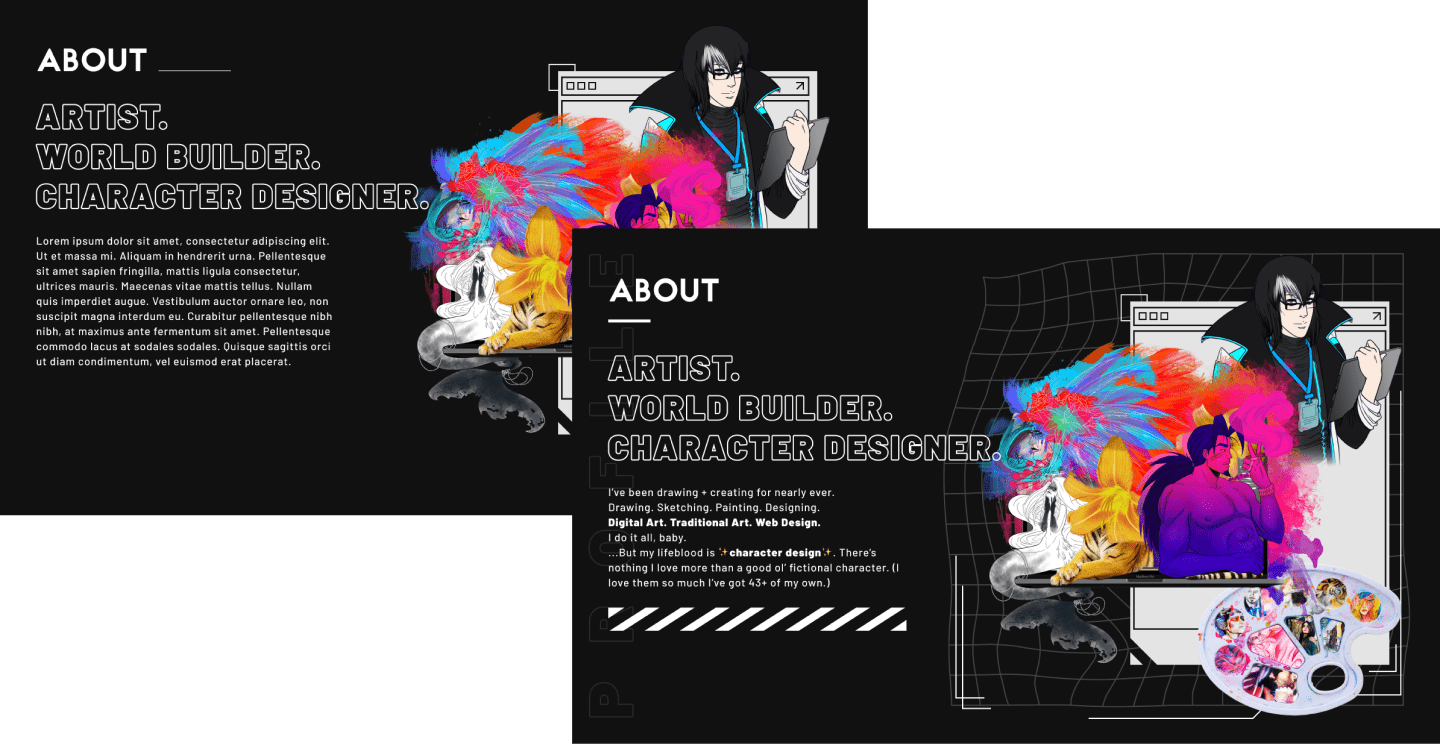
Mockups. Mockups. Mockups.
I gathered [tons of] inspiration and slapped it into Figma in a mood-board-esque manner, allowing me to quickly (and often) re-gather and push myself as I developed high-fidelity mockups.
Could I have thrown together something easy, breezy, and "lo-fi"? Totally. But then I wouldn't be able to nitpick things like accent colors and adjust section backgrounds and layouts based on content. Low-fidelity is great for a quick turnaround and a general basis, but sometimes you really need to know if the content is going to be two sentences... or two paragraphs.
Iterations.
I tend to be indecisive with designs (I get hung up on tiny details... and colors...), so iterations are a must for me. Sometimes I need to just see how a concept will look—that way I can do a side-by-side comparison.
I also tend to pick iterations apart in order to sort of "frankenstein" a new concept together. Sometimes it's a hit, and that's what I end up going with; sometimes it's a miss that leaves me with nothing but a laugh. That is, after all, why they call it a "process".
Overachieving.
Joking aside, I actually made more work for myself with this rebrand. Responsive design requires image optimization, which means "1 =/= 1". One image can need, at minimum, four versions. Unfortunately, this principle doesn't apply to me—I'm still only one person.
Regardless, I've proved to myself for the thousandth time that I'm willing to put in the hard work to achieve anything, always—no matter what.
Drafts & Concepts
Headers


Sections

Navigation
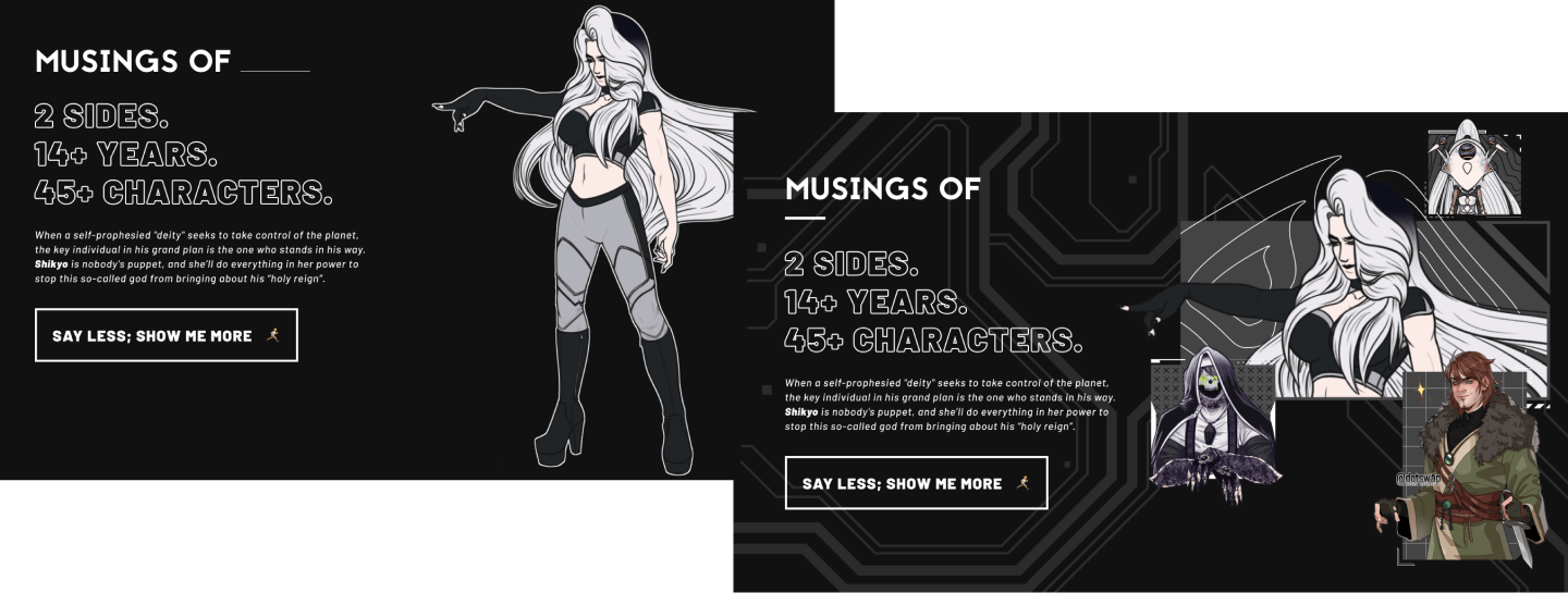
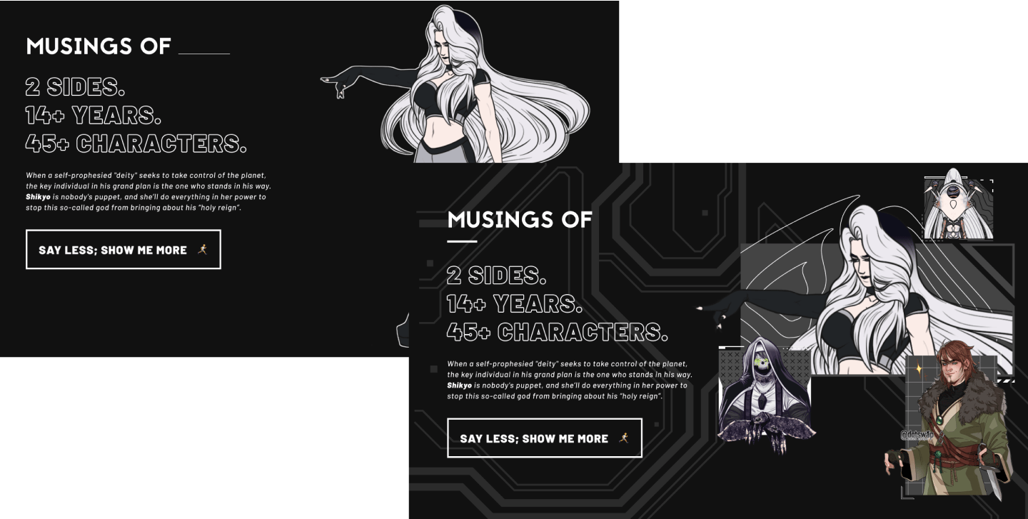
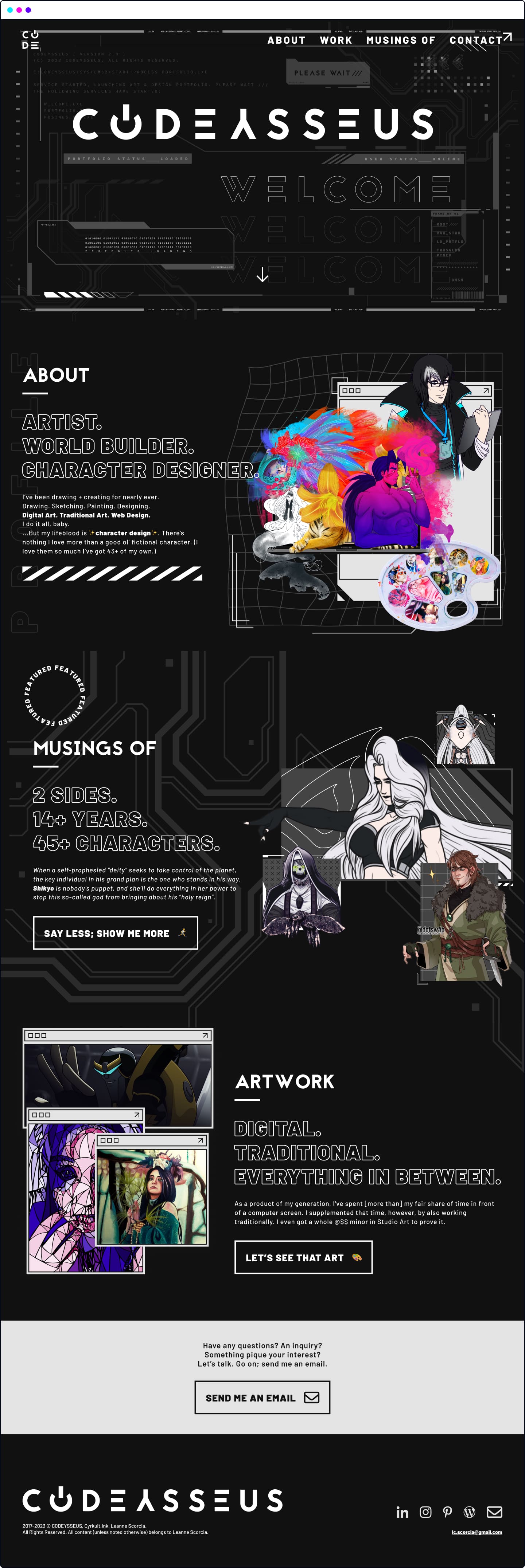
When I first built c0deysseus.com, the “thing to do” was keep visitors up-to-date with new content — and to lead them towards said content. This works well... when the website isn’t updated and maintained by a single person. Or at least works well if that single person updates the site regularly. Since I didn’t have a blog dedicated to this website — and I only added to my character pages once every *cough* eight months *cough* — I realized that the “What’s New” item wasn’t worth keeping. I also realized that I could repurpose that real estate to showcase the item I truly care about: Musings Of.
In doing so, I pulled “Musings Of” out and moved it up two whole levels in the new navigation. If this project is my life’s work, why was I keeping it buried under “Portfolio”... and then under “Game Design”?
Old Hierarchy

With “Portfolio” sitting at the top-most level in the nav as a point of interest (unclickable, however), you had to navigate through an entire drop down to get to the “Game Design” header item. Under there were two visible subitems: “Musings Of”, and “Concept Art”.
(In the rework, I also removed the “Concept Art” subitem and page, entirely — since it was a page dedicated to housing three whole project items. Lame.)
New Hierarchy

✨Wow!✨ Two whole levels, completely removed! I even threw in a sparkle emoji next to the “Characters” subitem to give it more emphasis... since that’s the page I care most about. I’ve got 45+ fictional children characters. I’m a little proud of them.
The Result.
I’m still currently accepting constructive criticism and feedback on this design, but I couldn’t be happier with (or more proud of) the result. As the second overhaul / third version shows, my skills as a designer and developer have skyrocketed. I could go on for a paragraph (or two) and drone on about the “upgrade process”, but... I think the results speak for themselves.


Get in touch.
Like what you see? Have a question? Excited to be able to soon peruse projects?
Let’s chat! Send me an email at:
lc.scorcia@gmail.com.